This website was never meant to bring in search traffic, but to close sales conversations. After a call with a waste collection company we sent a message with a link, and the company could open an account straight from the page. We built it on the same platform as the rest of the system, so a visit to the website and work inside the panel are one session of the same user.
Tidly is an in-house RapidLogic project, a two-sided platform connecting homeowners with waste collection companies. We have already described the marketplace, the dispatcher panel, the driver app and the customer app. All four show the system from the inside, the way it looks to someone who already has an account. This case study covers the only window through which someone who is not a customer yet gets to look.
We started with the question of why this website should exist at all, and the answer turned out to differ from the obvious one. The website was not meant to attract search traffic, but to close sales conversations. After a call with a waste collection company we sent a message with materials and a link, and the page had a few minutes to explain what the system is and let the company open an account right away.
Every other decision followed from that, including the most important one: since the website is part of the sales process rather than a leaflet next to the product, it should run on the same platform as the product.
A two-sided platform carries a communication problem by design. On one side there is the homeowner who wants to stop calling companies. On the other, the waste collection company that wants to stop answering those calls. The same system solves both, except each side hears a completely different promise.
Conversations with operators surfaced one more thing that was invisible at the start. A company with a dozen trucks and a company with one truck are not the same customer. The first has a dispatcher, an office and a routing problem. The second is an owner-driver who writes invoices in the evening because he drives all day. An argument about automated territory planning means nothing to him, while a sentence about invoicing at night lands immediately.
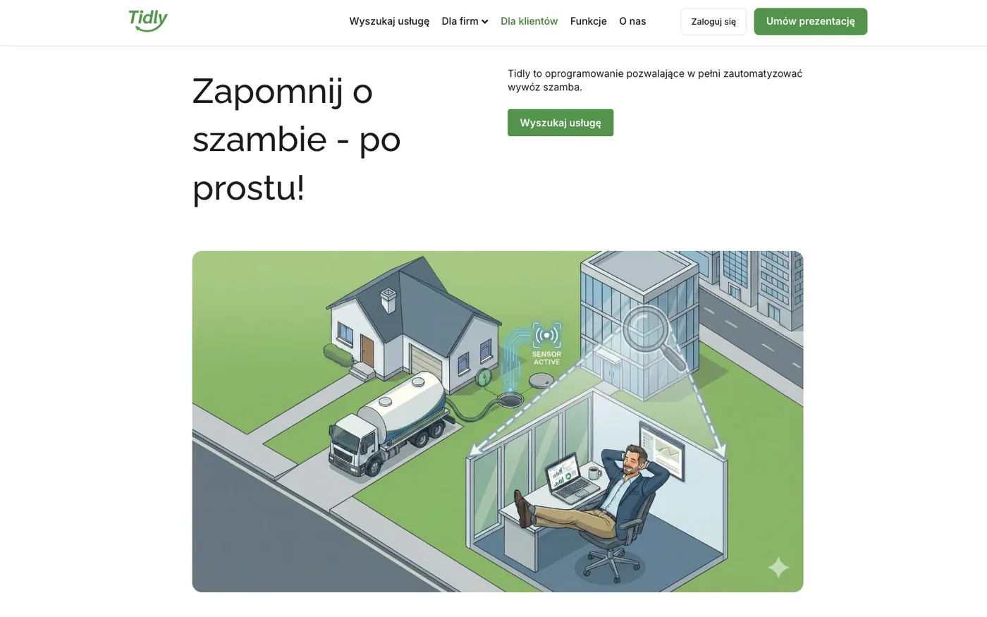
The home page does not try to sell anything. Its only job is to send the visitor the right way, which is why we put two calls to action side by side under the headline: search for a service for the homeowner, and a presentation for the company. The same split repeats in the navigation.
Selling begins only past that fork, separately in each of the three tracks.
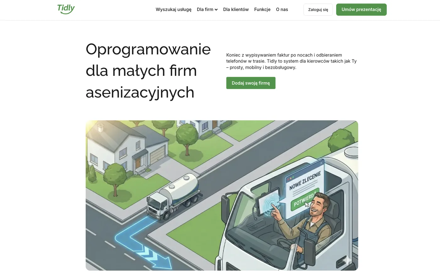
With one or three trucks the owner is the driver, the dispatcher and the accounting department at the same time. The headline calls it software for drivers, and the promise addresses what this person does after hours: writing invoices in the evening and answering the phone on the road.
For an owner-driver what counts is simplicity and a system that runs without being managed.
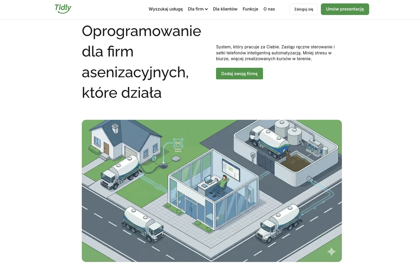
A company with a fleet has a completely different bottleneck. There is a dispatcher, the phone rings all day, and profitability depends on how the routes are arranged. The promise therefore is not about one person's comfort, but about replacing manual control with automation and about the number of jobs the fleet manages to complete.
The visuals follow the same distinction. The small company sees a cab and a single job, the large one sees an office, a fleet on the road and a treatment plant from above.
The same product, a different promise: automation instead of manual control, and more jobs completed.
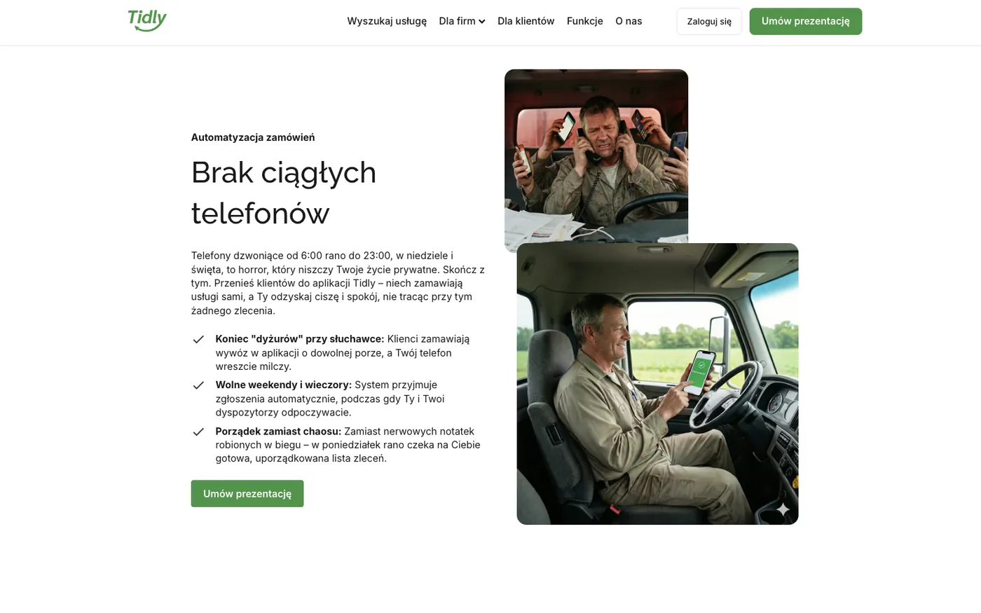
Two sections on both company subpages do not list features, they put two situations next to each other. In the section about phone calls, the left side carries text about calls from six in the morning until eleven at night, on Sundays and holidays, and the right side carries two photographs: a driver with two phones at his ear, and the same driver calmly looking at one screen.
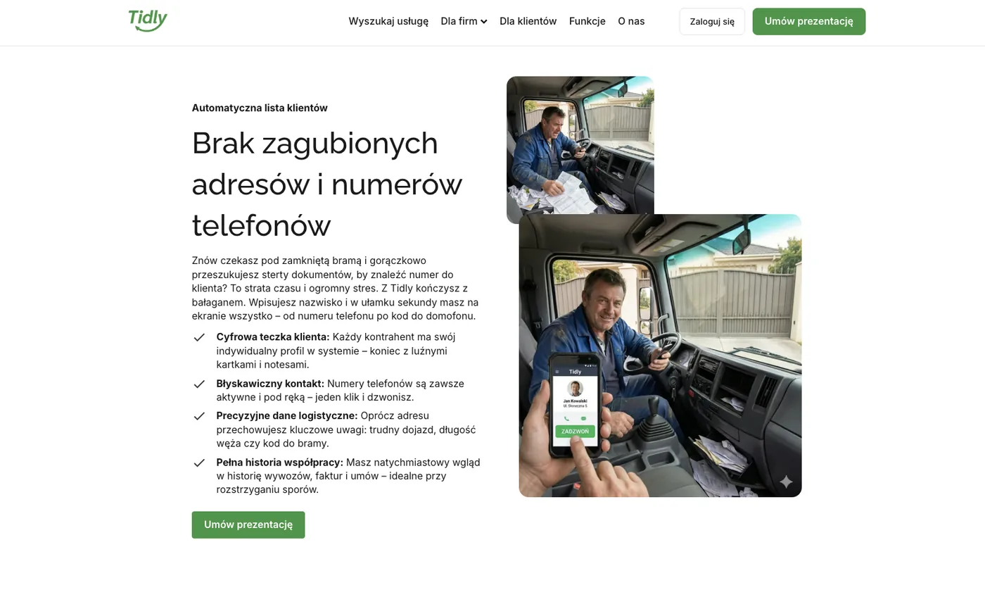
The second section does the same with paperwork. A pile of documents in the cab against an app where the address, the gate code and the required hose length sit next to the job. This is the same material we described in the dispatcher panel as the digital customer file, only phrased as a benefit rather than a feature.
The promise delivered as the difference between two photographs of the same person.
The digital customer file described by what it gives the driver, not by how it works.
The third track leads to the homeowner, and that conversation looks nothing like the other two. The owner of a septic tank cares neither about fleets nor about invoices, only about not having to think about the tank at all. The subpage headline therefore sounds exactly the way that problem sounds when someone says it out loud.
For a homeowner the promise is not a feature, it is having one less thing to think about.
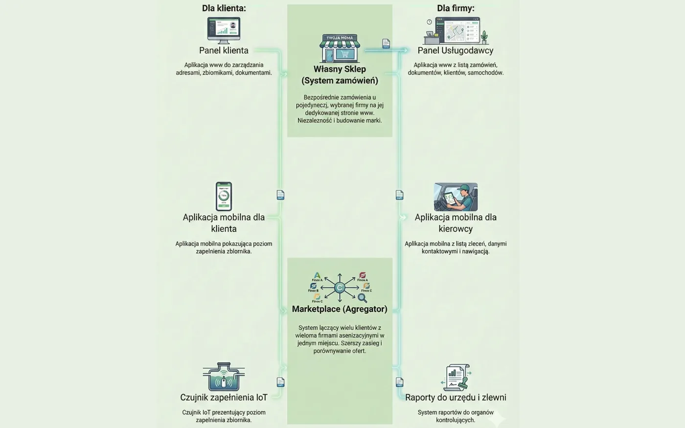
Whenever a sales conversation reached the question of what this actually is, words stopped being enough. Tidly is not one application but seven parts working together, and that is hard to tell in an email. Hence the diagram: on the left what the customer gets, on the right what the company gets, and in the middle two ways of taking orders, the company's own shop and the marketplace.
Seven parts of the platform in one picture, instead of a paragraph nobody reads to the end.
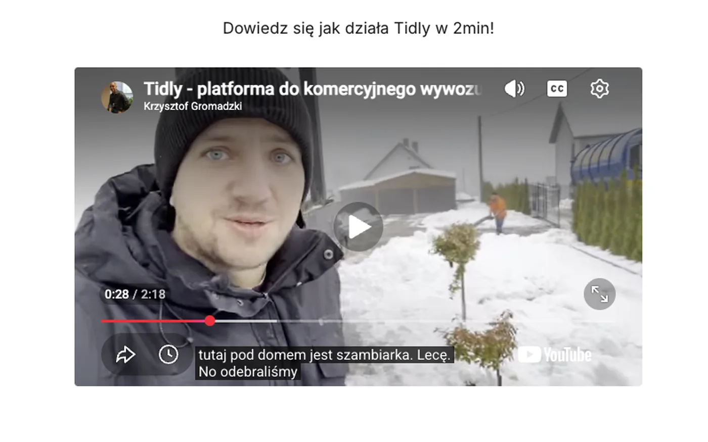
The last element is a two-minute video that shows the problem where it happens: at the tank, in winter, on a driveway. Filming and editing took six hours and were done entirely in-house.
This is the same mechanism as the driver photographs. The viewer is meant to recognise a situation before hearing what the system does about it.
Two minutes at a tank explain the platform better than a paragraph about automation.
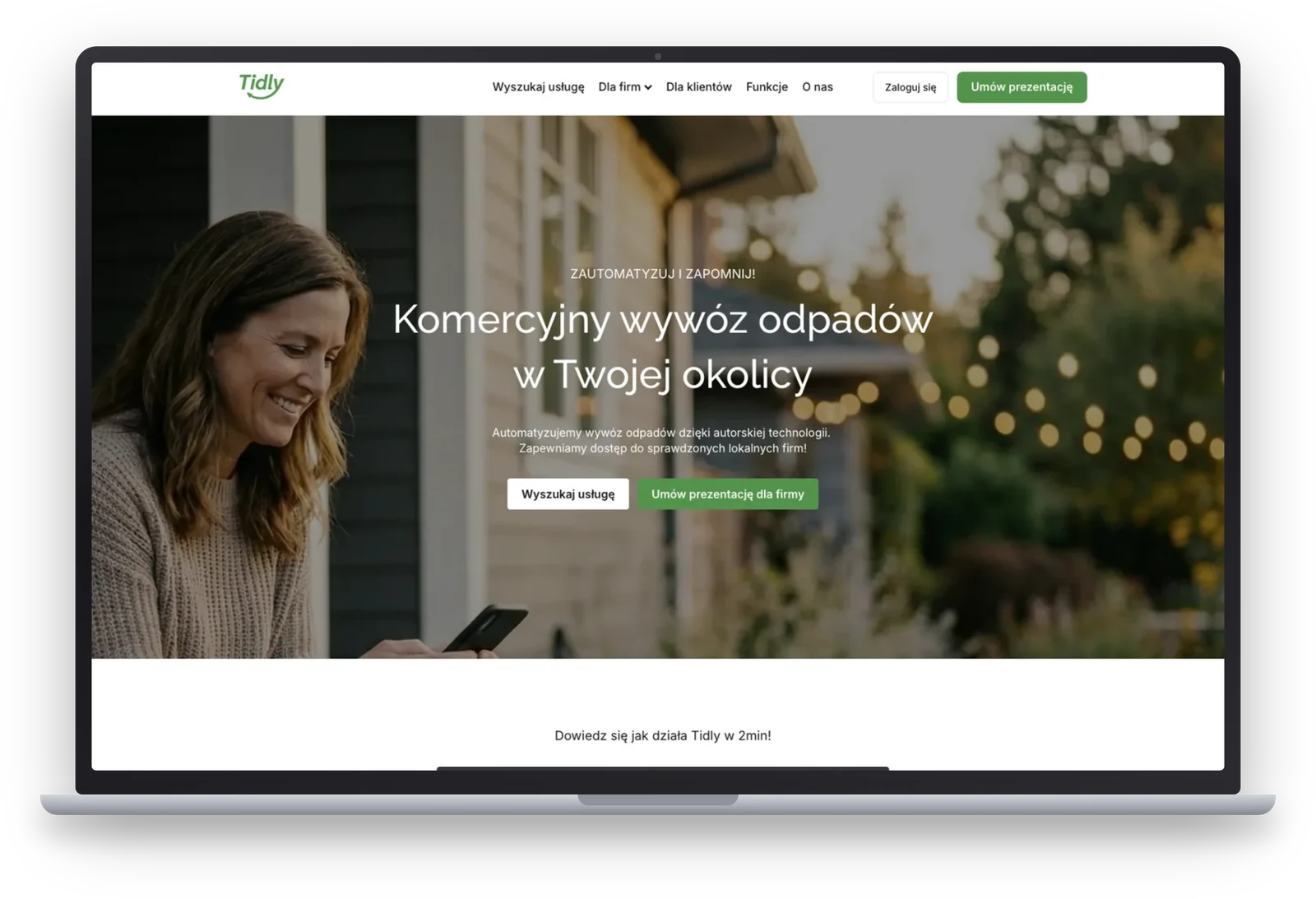
The usual arrangement in projects like this has the sales website built in one tool and the product in another. We chose the opposite and built the website on the same platform as the marketplace and the panels. There were four reasons.
That last point is the one you cannot see in a screenshot. When the website operates next to the system, a visit and a later sign-up are two unrelated events. When it is part of the system, they are one path, and the data left behind stays consistent.
The website was built for one job, and everything that did not serve that job was postponed. With a sales website the first association goes to search optimisation, and here there deliberately is none.
How far this went. Analytics was prepared to measure traffic, while the website never received traffic at the intended scale. We started with local conversations, and before a larger campaign happened, the state-run Aquarius system appeared and the decision was made to pause Tidly, which we describe in the marketplace case study. So we have no sales results for this website.
The website was built alongside the platform, while the visuals and the video were separate work, outside the base estimate for the whole ecosystem. Below is how that part ran.
This website has no sales results, because the campaign never started. What it does have is a measured amount of work and a set of decisions that transfer to any project where one offer reaches several different audiences.
Many companies need a website like this: every company that sells a system or a service and wants to close sales conversations. What sets this project apart is not the website itself, however, but the fact that it is grown into the system. For marketplaces and service companies that means the path from a first visit to an open account is one path, not two independent tools bolted together.
The second lesson is about segmentation. If you hear two different problems in your sales calls, you have two different customers, even when you sell them the same product. Splitting the website into three tracks cost a few hours of copywriting, while without it every one of those conversations would start by explaining why the offer concerns the person on the other end at all.
Today we would build this faster. The same scope delivered with AI-assisted engineering, which we show in the Fortress and Invoices case studies, takes around three times less time and money.
Technological consistency is serious leverage. Everything can be managed from one panel, the user logs in on the sales website and moves to their panel or to the marketplace, all the time within the context of their account. For us that means consistent data, not two separate worlds that somebody has to stitch together later.
Splitting the traffic at the entrance, a separate promise for each audience and a website tightly connected to the system: in Tidly that scope closed in forty six hours. A free digital audit will show what such a website could look like for you and what could be connected to your system.
Book a free digital audit